
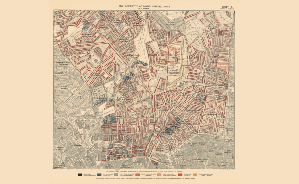
Figure 1. C. Booth, The Map Description of London Poverty. Source: LSE, C. Booth’s Archive, 2016
The walls of impoverished neighborhoods in cities in the U.S. and Europe have been reinforced in the past decades. Public policy has increased social and economic segregation. Inequality and social exclusion have been sustained over long periods of time. It has structured the lack of opportunities available to families living in the neighborhoods. For generations it has become their unwanted inheritance, from which only few manage to escape.
In the 1880s, the social reformer Charles Booth, an industrialist and social philanthropist, set out to conduct a scientific inquiry into the economic situation of the population of London on a street-by-street basis. The Victorian era had seen major industrial progress during the second half of the 19th century. London’s population had exploded, with people moving from the countryside to the city in search of work. Most of them had ended up living in extreme poverty in slums.
Booth’s circle included notable figures such as Beatrice Potter, Octavia Hill of the Charity Organization, and Canon Samuel Barnett, circles in which social problems of the day attracted discussion. The unprecedented scale of poverty, and the sensational press attention it attracted, resulted in Henry Hyndman’s publication in 1885 on an inquiry into poverty conducted by the Social Democratic Federation. The report claimed that 25 per cent of the population lived in extreme poverty. In 1886 Booth visited Hyndman, telling the latter he had grossly overstated the situation, and that Booth himself would be undertaking an inquiry to correct matters.
An early and brilliant example of social cartography, Booth would produce a striking series of maps representing the social conditions in London, with houses color-coded by income and criminal tendencies. Areas colored yellow were “upper-middle class, upper

Figure 2. Sample from Charles Booth’s Notebooks. Source: LSE, C. Booth’s Archive, 2016.
class, and wealthy”, areas colored red were “middle class”, while black areas were described as “lowest class, street sellers, vicious, destitute, and semi-criminal”.
The Map Description of London Poverty, published in 1898-1899, comprising 12 sheets, became the most distinct part of Booth’s publication on the Life and Labour of the People in London, 17 vol. (1889-1902), and was widely circulated. The report’s conclusion, that a staggering 30.7 per cent of the London population was living in poverty, generated significant interest.
Booth’s maps vividly illustrate the geographical distribution of poverty, challenging many contemporary assumptions about the poor. The maps contributed towards a more systemic and secular understanding of the causality and differing experiences of poverty. The methodology was ground-breaking and innovative, combining unprecedented levels of empirical research, collecting qualitative data on people’s urban lives, occupations, their homes and religious beliefs, and the environment they lived in. Special studies were undertaken by a team of social investigators into trades associated with poverty, population movements, education, the Jewish community, investigating every job and trade in London to establish wage levels and conditions of employment. The series also covered the unemployed, inmates from institutions, workhouses, the lives and employment of women, leisure activities, local government and police, and consulted clergymen, schools and charitable organizations, all described in great detail. The Charles Booth archive held by the London School of Economics contains more than 450 notebooks from the survey.
Combining statistics with local interviews and color, the maps provide snapshots of different neighborhoods, from bowler-hatted insurance agents passing the streets of Tower Hamlets, to prostitutes and thieves at King’s Cross. Booth notes the homeloving residents of Peekam Rye, “seldom out late and not much given to entertainment”. He discovered that regularity of income played the largest part in determining poverty status. Of the 4,076 individuals Booth studied, 62 per cent were paid low or irregular wages.
Booth’s maps highlighted the role of geographical settings in social conditions. For the first time the importance of spatial distribution on the reshaping of social class was described, mediated by urban restructuring, gentrification, and territorial stigmatization. “Poverty areas” in 19th century London often were literally walled off from the rest of the city by barrier-like boundaries that isolated their inhabitants, devaluated classes of people by creating enclaves of deprivation and poverty, and minimized their normal participation in the life of the city. There are many accounts of dockers having to live within reach of the port, or tailors within short distance of the tailoring industry’s heartland.
Booth established what the conditions were in which urban poverty took place, and showed social destiny was tied to geography. It would be left to Bernard Shaw, the most widely read socialist writer in the English world, haunted by the Dublin slums of his childhood, to campaign in his works to banish the fallacy that poverty essentially was a moral failing, and that great riches were proof of moral worth. To Shaw poverty was about the way society was organized, not about a lack of work ethics of the poor. After all, Eliza Doolittle, a Cockney flower girl brilliantly played by Julie Andrews in the Broadway musical My Fair Lady in 1956 based on Shaw’s play Pygmalion, is out selling flowers in the pouring rain, but she is still dirt poor.
Booth would have had no trouble in recognizing the conditions he unveiled through his research in today’s world. The similarities are striking. A Eurobarometer report of 2010 examining explanations for poverty, showed a stunning 45 per cent of respondents explaining poverty as the result of laziness, lack of willpower, the cost of progress, or simply bad luck, arguments that were also raging in the 19th and early 20th centuries.
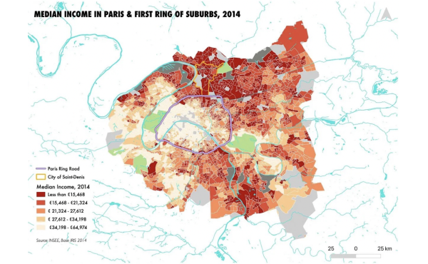
Figure 3. Median Income in Paris and Suburbs 2014. Source: INSEE, Base Iris, 2014.
The urban fabric in the 21st century is as segregated as it was in the late 19th century. With housing prices having more than tripled since 2000, geography has become an even stronger indicator of social status, whereas economic mobility between areas is decreasing. Examples that stand out are Hackney Wick in London, or the Philadelphian metropolitan area in the U.S., with over 80 per cent white resident neighborhoods, and over 80 per cent non-white resident neighborhoods, where the pace of desegregation has slowed. Another example one finds in Paris, as the above chart, inspired by Booth’s maps, shows. There are 113 slums in the greater Paris region of Ile de France. The 17th arrondissement, with strong internal segregation, acts as divider between the east and west, with the 18th and 19th arrondissements, at the heart of Paris Olympics 2028, considered the poorest areas of Paris.
THE CHART
@ Theorems LLC – All Rights Reserved
DISCLAIMER: The information and material presented herein are provided for information purposes only and should under no circumstance be used or construed as a solicitation or offering to acquire, dispose, or engage in any financial dealing, including but not limited to the buying or subscribing for securities, investment products, or other financial instruments, nor to constitute any advise or recommendation with respect to such securities, investment products, or other financial instruments. This Chart is prepared for general circulation and has no regard to any class of investor or the specific investment objectives or particular needs of any specific person which may receive this Chart. Readers should independently evaluate the information and material contained herein before making any investment or other decision, and should take appropriate independent financial advice before making any investments or entering into any transaction in relation to any content mentioned in this Chart. It is a violation of U.S. federal and international copyright laws to reproduce all or part of this publication by email, facsimile or any other means. This document is not for attribution in any publication, and you should not disseminate, distribute, or copy this Chart, either in whole or in part, without the prior written consent of Theorems LLC
Publisher – THEOREMS LLC
Enquiries – THEOREMS LLC
667 Madison Avenue
New York NY 10065
United States
Editor – Ana Beysoylu
